Section 2: How to Combine Colors Innovatively
Embracing the Unconventional
The most memorable interiors dare to surprise us. This section is dedicated to the fearless exploration of color, pushing past traditional boundaries to discover combinations as unique as they are beautiful.
Unexpected Pairings That Pop
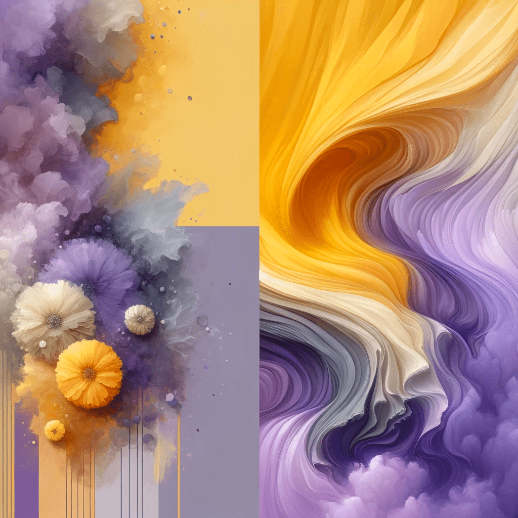
A successful, unexpected color combination challenges our expectations and delights our senses at the same time. Imagine the crispness of chartreuse (yellow-green or greenish-yellow) juxtaposed with the deep, velvety hue of burgundy or a muted lavender that can make the sunny disposition of marigold truly sing. These pairings can inject life into a design, creating a visual dialogue that is both fresh and invigorating.


Mastering the Mix
The secret to these striking combinations lies in a deep understanding of color properties—how hues interact, their visual weight, and their emotional resonance. Neon coral might overwhelm when used in large swathes, but as an accent against a midnight blue backdrop, it becomes a sophisticated eye-catcher.

Case Studies of Rule-Defying Interiors
Let’s take a closer look at some examples of unexpected color pairings:
- The Retro Revival: A living room that pays homage to the vibrant ’70s with a palette of olive green and harvest gold, accented with splashes of tangerine. The designer has skillfully navigated the fine line between retro kitsch and contemporary chic, using these colors in geometric patterns and sleek modern furniture to create a nostalgic and forward-thinking space.
- The Urban Oasis: Here, a daring designer has transformed a compact city apartment into a lush retreat using a palette of peacock blue and emerald green, with touches of blush pink. The result is a space that feels like a secret garden in the heart of the city.
Techniques for Trailblazing with Color
These case studies showcase how color placement, proportion, and the interplay with light and texture can make unconventional color choices work and thrive. Here are some tips that may assist you when experimenting with colors.
- Use color to shape the perception of space, making rooms feel larger or cozier.
- Combine matte and glossy finishes to add depth and interest.
- Introduce metallics as neutrals to bridge bold color choices.

Your Palette, Your Narrative
By the end of this lesson, you’ll be able to craft your own color narrative that goes beyond the expected and tells your unique story. Whether through a daring feature wall, an eclectic collection of accessories, or a single piece of statement furniture, you’ll learn how to add color to your space in a personal and impactful way.
Remember also that the journey through color is an adventure in self-expression that aims to inspire you to experiment with colors and paint your world in a new light.
References
- Eiseman, L. (2017). The Complete Color Harmony, Pantone Edition: Expert Color Information for Professional Results. Rockport Publishers.
- Wright, A. (2008). The Beginner’s Guide to Colour Psychology. Kyle Cathie.
- Helfand, J. (2011). Design: The Invention of Desire. Yale University Press.
- Adler, J. (2012). 100 Ways to Happy Chic Your Life. Union Square & Co.
- Wearstler, K. (2004). Modern Glamour: The Art of Unexpected Style. Regan Books.
Further Readings
- Mollica, P. (2013). Color Theory: An Essential Guide to Color-From Basic Principles to Practical Applications. Walter Foster Publishing.
- Atwood, R. (2019). Living with Color: Inspiration and How-Tos to Brighten Up Your Home. Clarkson Potter.
- Starmer, A. (2012). The Color Scheme Bible: Inspirational Palettes for Designing Home Interiors. Firefly Books.
- Lee, I. F. (2018). Joyful: The Surprising Power of Ordinary Things to Create Extraordinary Happiness. Little, Brown Spark.
- Hornung, D. (2012). Color: A Workshop for Artists and Designers. Laurence King Publishing.
